After 5 years, the world has changed. We’ve evolved our look and feel to change with it.
Updated on: Feb 24, 2026 5 Minute Read
New look, same legendary platform
Hyperproof recently celebrated our fifth anniversary. While this was an incredible milestone, it also gave us a chance to reflect on what we’ve accomplished so far, and, more importantly, look ahead to study how we can evolve.
Over the last five years, we’ve grown from a shoestring startup to a thriving company of over 100 employees who are passionate about engineering trust in workplaces around the world. And as we’ve scaled, our product has scaled, too. It was about time that we updated our look and feel to reflect our growth.
Take it from our CEO, Craig Unger:
“Refreshing our brand is a reflection of how Hyperproof continues to evolve with the market and improve our services. Our philosophy is to put our users first, and we kept them in mind with every decision we made during this brand update.”
Why update now?

As we approached Hyperproof’s five-year anniversary, we asked ourselves, “What truly makes us stand apart?” We realized that what makes us different is that we’re a platform built by and for compliance experts. Our users — who are typically from industry-leading organizations and larger enterprises — deeply care about security, risk, and compliance, and are laser-focused on ensuring the right things happen to enable growth and the wrong things don’t happen.
As a result, we expanded our mission to ensure it aligned with our growing customer base, particularly our enterprise customers. We also wanted to highlight how our platform has evolved over time from focusing on core compliance to delivering a comprehensive security, risk, and compliance solution.
So, we got to work. Since January of 2021, we’ve been evolving our brand to a place that highlights the importance of our users. We conducted surveys of thousands of industry experts like you to understand how we currently communicated with our potential customers. Overwhelmingly, you wanted to see more brevity from us, as well as more contrast with our colors. You wanted us to mature our voice, and, most importantly, you wanted to see yourselves more strongly reflected in the brand.
We listened. We analyzed your feedback and then looked inward to identify what matters most to us: you.
Putting people first

When refreshing our brand, we wanted a visual identity that celebrates the incredible heroes who use Hyperproof to do the right things — at the right time — so the wrong things don’t happen. How our actions impact our users is at the heart of every decision we make, and we wanted to double down on this fact for our brand.
As a result, we put the risk and compliance heroes who want to do the right thing first by centering their stories. Both visually and through storytelling, we’re bringing people into the picture. You’ll see more images of actual people featured in our refreshed brand alongside our illustrations. Don’t get us wrong — our fun illustrations aren’t going anywhere, but we’re bringing real humans into the story.
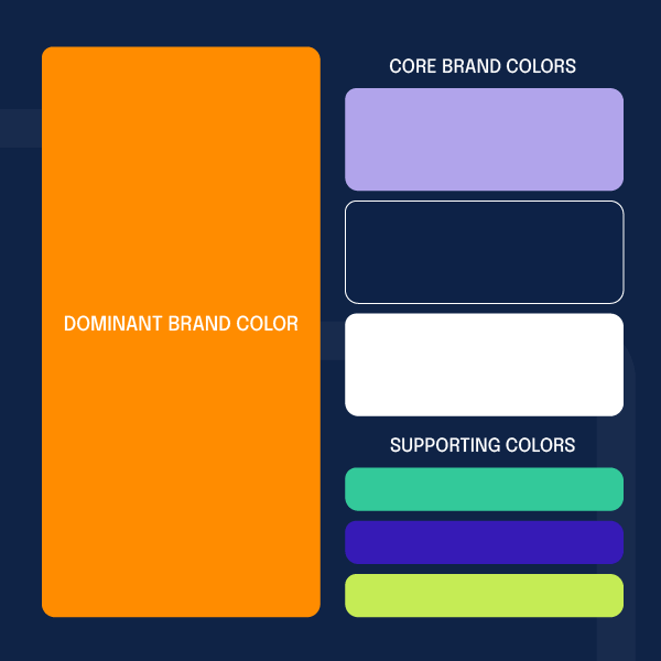
Introducing our new color palette
As we evolved, we wanted to be bolder in the way we present ourselves. We punched up our color palette to highlight our classic orange even more by adding different supporting colors like navy, light purple, white, and green. We chose these colors because they represent our energy and passion for helping our users become compliant and manage risk the right way.
A streamlined logo
In the spirit of simplicity, we’ve tweaked the logo a bit to be more modern, less busy, and more focused on our logomark.
Ever wondered what the three circles mean?
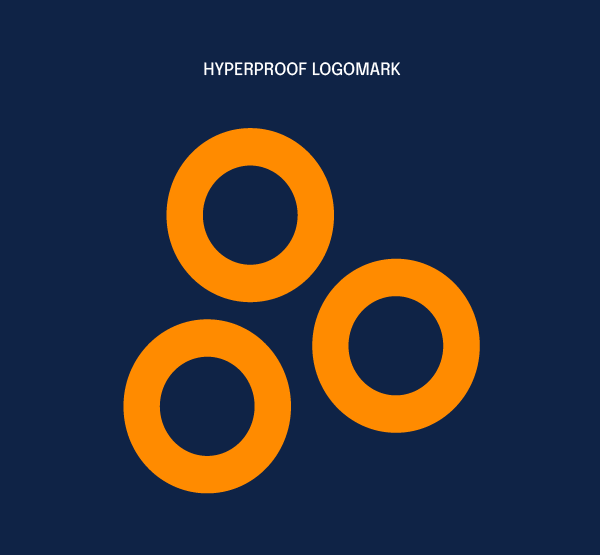
Hyperproof has (and always will be) centered around the concept of the need to show proof, whether it’s demonstrating that a requirement is met or that an audit has been passed. We wanted to ensure that the concept of proof continued to be woven into our logo and brand.
In logical argument and mathematical proof, the therefore sign ( ∴ ) is generally used to denote proof, which is represented in our logomark.
A new tagline

Our new tagline is:

“We” represents our entire ecosystem.
WE
We, our Customers
We, our Partners
We, our Ecosystem (CPA)
We, our Fellow Hyperproofers
The work we all do is uber complex.
ENGINEER
Customers engineer and manage risk and compliance
Partners engineer and manage risk and compliance
CPA firms engineer and manage complex audits
Hyperproofers engineer legendary software
TRUST
The result we all strive for.
Updated typography

Our enterprise customers and prospects love simplicity, clarity, minimalism, and the ability to get the work done efficiently, which is why we chose Epilogue as our new typeface.
Epilogue is a sans serif typeface with a little extra ornamentation to it because it conveys three things:
- Our commitment to helping you get the work done so you can focus on more strategic tasks
- Our newfound commitment to brevity and clarity
- Our dedication to being as inclusive and people-centric as possible
Want to see more? Explore our website!
If you’re reading this, it should come as no surprise that these changes are already in play. We updated our look, the way content is organized, and our messaging to better speak to you. You’ll also see our refreshed brand on social media starting today, so keep an eye on our LinkedIn and G2 pages.
See Hyperproof in Action
Related Resources
Ready to see Hyperproof in action?